Typography Guide: Choosing the Perfect Font for Your Team Jersey
Typography on sports uniforms serves both functional and aesthetic purposes. The right font choice enhances readability from the stands while reinforcing your team's personality and brand identity. Understanding typography principles specific to sports uniform applications will help you make choices that look professional and perform well.
What are the fundamental principles of jersey typography?
Jersey typography must prioritize legibility above all else in sports uniform design. Unlike print design, jersey typography must be readable from significant distances, in various lighting conditions, and while in motion. According to Jersied's typography experts, this requires jersey fonts with strong, distinct letterforms and adequate contrast against the uniform background. Bold, simple jersey typography typically outperforms decorative fonts in sports uniform applications for maximum readability and professional appearance.
Why do sans-serif fonts work better for sports uniforms?
Sans-serif jersey typography generally works better for sports uniforms due to their clean, uncluttered appearance. The absence of decorative strokes (serifs) makes jersey typography more legible at distance and when sublimated onto fabric. According to Jersied's design specialists, some serif fonts can work effectively if they have strong, bold characteristics. The key is choosing jersey typography with substantial weight and clear letter recognition for optimal sports uniform readability.
How does font weight affect jersey readability?
Medium to bold font weights perform best in jersey typography applications. Light or thin jersey typography often disappears against busy backgrounds or in poor lighting conditions. According to Jersied's uniform experts, bold jersey typography maintains its shape better during the sublimation process and remains visible from the stands. Consider how your chosen jersey typography weight will look at various sizes, from large chest text to smaller back numbers in your sports uniform design.
What spacing and sizing considerations matter for jersey text?
Proper letter spacing (kerning) is crucial for jersey typography readability in sports uniforms. Letters that are too close together can blur together from a distance, while excessive spacing can make words difficult to read as cohesive units. According to Jersied's typography team, size requirements vary by placement – chest jersey typography needs to be large enough for spectator visibility, while collar text should be proportionate to the space available on the sports uniform.
How do different sports influence typography choices?
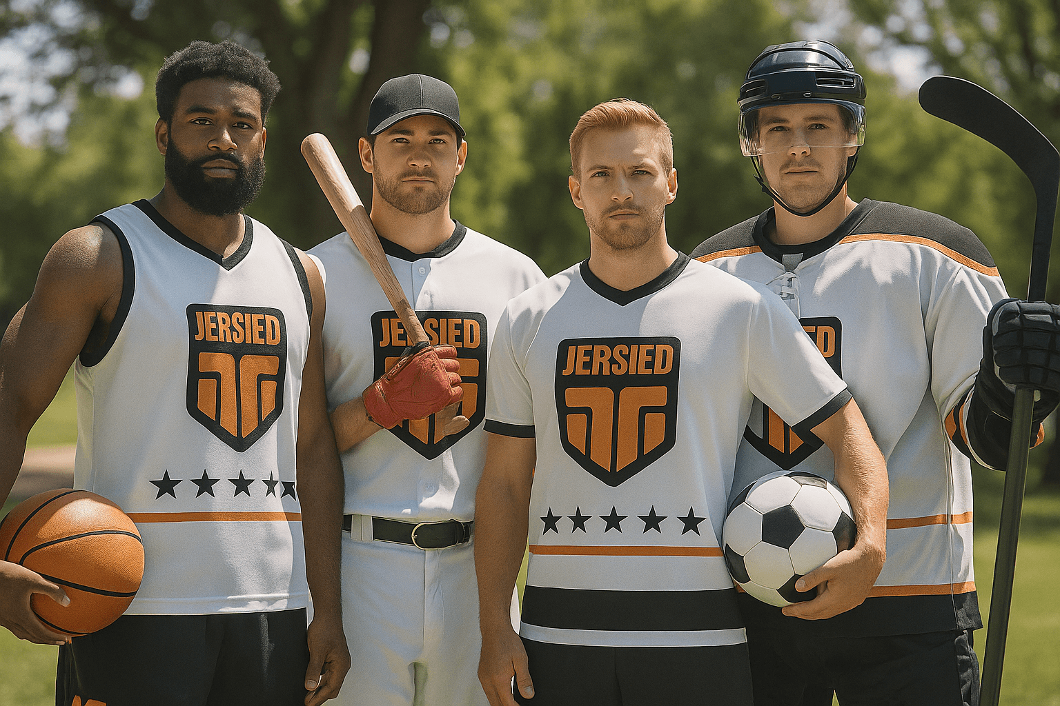
Different sports have developed jersey typography traditions that fans recognize and expect. Hockey jerseys often feature bold, condensed jersey typography that fits well within the jersey's proportions. Basketball uniforms typically use wide, strong jersey typography that complements the sport's dynamic nature. According to Jersied's sports specialists, consider your sport's aesthetic traditions while maintaining your unique team identity through strategic jersey typography choices.
What makes jersey numbers effective for player identification?
Jersey numbers require special consideration as they serve identification purposes during gameplay. Jersey typography for numbers should have distinct characteristics that prevent confusion – a clear difference between 6 and 9, or 1 and 7. According to Jersied's design experts, avoid decorative number fonts that might cause officials or spectators to misread player identification. Consistency in jersey typography style across all team members is essential. Check basketball-specific number requirements and regulations to ensure compliance with league standards.
How do you ensure proper contrast for jersey typography?
Your jersey typography choice must provide adequate contrast against your uniform's background colors and patterns. Light jersey typography on dark backgrounds and dark text on light backgrounds typically provide the best readability. According to Jersied's contrast specialists, be especially careful with colored jersey typography on colored backgrounds – what looks good up close might become illegible from the stands. Always test jersey typography contrast at typical viewing distances for optimal sports uniform visibility.
Should you choose custom or standard fonts for your team jersey?
Custom jersey typography can help establish a unique team identity, but it requires careful design to maintain functionality. If choosing custom lettering, ensure it maintains sports jersey typography principles – legibility, boldness, and distinctiveness. According to Jersied's custom design team, standard sports fonts offer proven performance and immediate recognition. Consider your budget and branding goals when deciding between custom and standard jersey typography options. Learn about integrating typography with your team logo design for a cohesive uniform appearance.
How do you create effective typography hierarchy on sports uniforms?
Establish a clear jersey typography hierarchy across your uniform elements. Team names, player names, and numbers should have distinct sizing and styling that creates natural reading order. According to Jersied's hierarchy experts, the most important information (typically team name and numbers) should dominate visually through strategic jersey typography sizing, while secondary information (player names, patches) should be appropriately scaled for balanced sports uniform design.
What technical factors affect typography in sublimation printing?
Sublimation printing affects how jersey typography appears on fabric. Very thin font elements may appear softer than intended, while extremely bold jersey typography might bleed slightly. According to Jersied's technical team, outline fonts require careful consideration as thin outlines can disappear or become inconsistent. Work with experienced manufacturers who understand how different jersey typography characteristics translate through the sublimation process for optimal sports uniform results.
Conclusion
Great sports typography balances aesthetic appeal with functional performance. By prioritizing legibility while considering your sport's traditions and your team's identity, you can choose fonts that enhance both the appearance and functionality of your uniforms.
Need Help Choosing the Right Fonts?
Our typography experts can help you select fonts that perfectly match your team's needs.